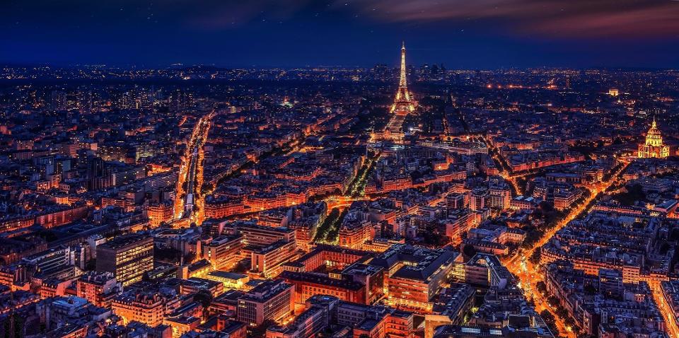
Paris Experiential Design IMAGE BY WALKERSSK
If you are lucky enough to have lived in Paris as a young man, then wherever you go for the rest of your life, it stays with you, for Paris is a moveable feast.
-Ernest Hemingway’s description of Paris
A brand, too, can be a moveable feast via experiential marketing. Experiential marketing is the field of moment-making where objective, sensory design elements come together to create an experience. Paris, in particular, uses visual contrast to draw attention and, ultimately, leave a lasting impression. Before dissecting the experiential design of Paris, we must first understand the neuroscience of contrast and attention.
The Neuroscience of Contrast
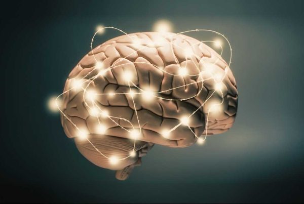
The brain, like a sailboat, is constantly looking for a place to anchor. It is a data-crunching, pattern-learning machine. In order to process all of the information in our environment, the brain uses shortcuts, and anchoring happens to be the brain’s favorite shortcut.
Anchoring is the brain’s tendency to process information relative to a reference point. Anchors create contrast because they serve as the mental background against which foregrounds stand out. Anchors are everywhere – from the sights we see to the sounds we hear. A white dot on top of a black canvas is high contrast, but even more fascinating, the same white dot against a grey canvas feels darker despite being the same hue. That is the impact of anchoring and contrast – it can alter our perception to make a genuine impression.
The Neuroscience of Attention
Beyond altering our perception, contrasts also drive our attention. Attention comes in two forms, what neuroscientists call exogenous and endogenous attention. Endogenous attention is driven from within because you have an internal goal. Imagine going for a walk to count all bikes you see.
Marketing to Contrasts
Anchors, and by extension, contrasts, are foundational to the customer experience. In some ways, this is old news to user experience designers. UX professionals have studied and applied the brain’s attraction to contrast for years. They use colors with high visual contrast for actions that are encouraged, add-to-cart, and save buttons are prime examples.
The science of anchors does not have to stop at UX. It impacts the entirety of the customer experience. With the resurgence of events and branded experiences, understanding the neuroscience of anchors is a must for experiential marketers. Degrees in UX are offered, but we have yet to see a degree in experiential marketing. Fear not, as Paris serves as a great teacher of experiential design.
Back to Paris
Paris is the original experiential city, and Georges Eugène Haussmann is the reason why. On the surface, he was a city official on the rise when Napoleon III (nephew of the Napoleon Bonaparte) came to power and handpicked Haussmann to redesign Paris. Behind the scenes, Haussmann was a closeted musician who passionately studied music at the Paris Conservatory after completing his law degree.
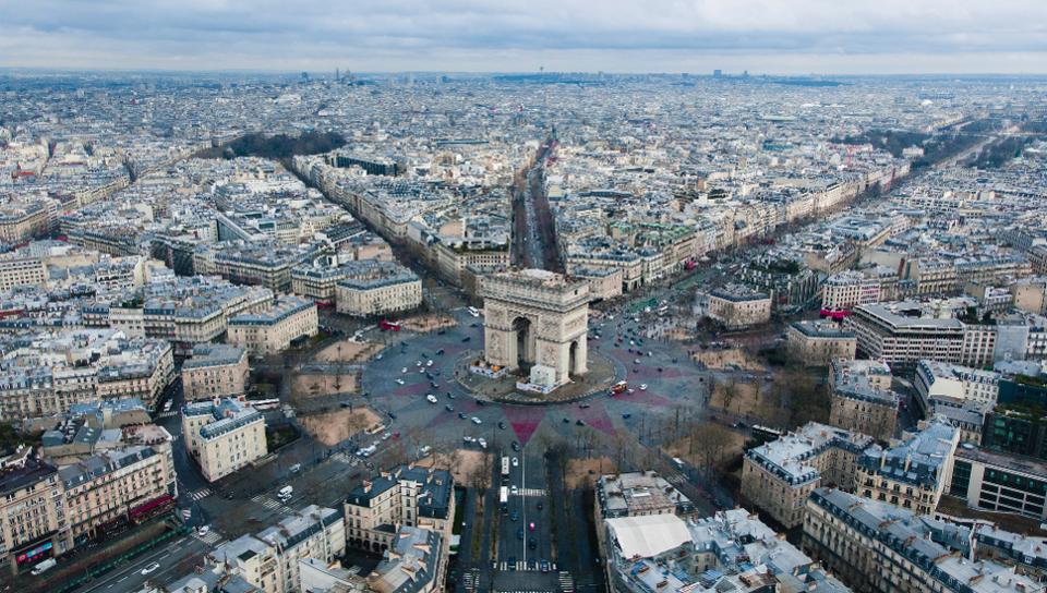
Experiential Design of Arc de Triomphe PHOTO BY RODRIGO KUGNHARSKI
Paris looks, and as a result, feels a specific way, partially due to him. Haussmann standardized the architecture of Paris. The width of the streets was set in proportion to the buildings. The buildings themselves were standardized to be no more than five stories tall with roofs required to be built at a forty-five-degree angle. The forty-five-degree roof lines guarantee sunlight reaches and kisses the cobblestones streets of Paris just right. Instead of right-angled city blocks, Haussmann standardized Parisian neighborhoods in a concentric circle. The center of the spiral is “zone 1” neighborhood, the next spiral labeled zone 2, the third spiral being zone 3, and so on.
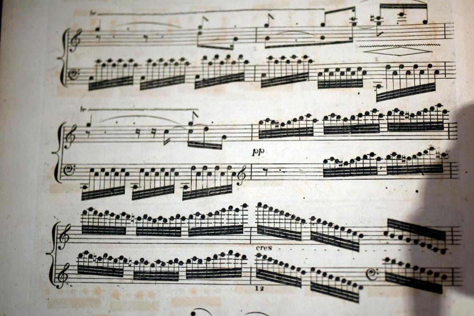
Sheet Music AFP VIA GETTY IMAGES
His love for music may have been an inspiration for the ultimate impression of Paris – the monuments. Sheet music is the written form of music where musical symbols are written on a series of five evenly-spaced horizontal lines. The musical notes are in sharp contrast to the uniform grid of five lines, giving the impression of the notes popping out at you.
Similar contrast exists in Paris. The world-famous monuments pop out from a background of forgettable buildings. Whether in photographs or in person, the contrast draws your attention and leaves a deep impression.
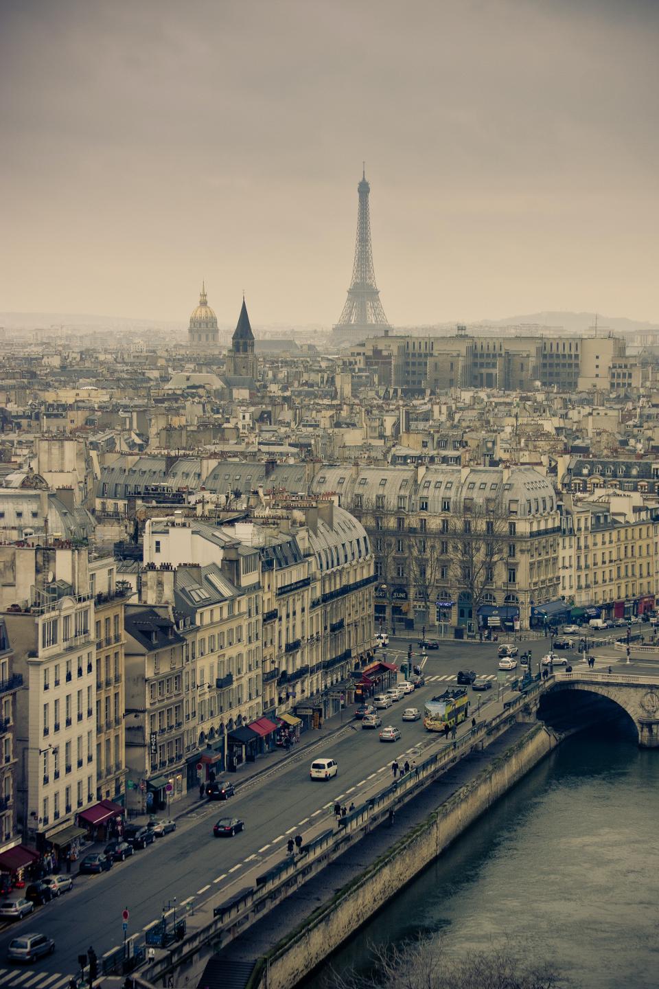
Paris Experiential Design PHOTO BY @ALEKSIII
Like a blank page of sheet music, the five-story buildings, forty-five-degree roofs, and spiraling neighborhoods serve as the anchor in the background. Like musical notes, the foreground of tall Parisian monuments dances in visual contrast to this anchor. The result of the design not only draws your attention but leaves you proverbially breathless.
The experience of the city of Paris famously inspired James Joyce, Zelda and F. Scott Fitzgerald, Gertrude Stein, and Ezra Pound. Hemingway even credits Paris for helping him get over writing blocks, “I would stand and look out over the roofs of Paris and think, ‘Do not worry. You have always written before, and you will write now.'”
Paris turns objective, sensory design elements into subjective inspiration; no wonder he called it a moveable feast.
Shouldn’t that be an aspiration for all of branding?
Source: What Paris Can Teach Us About Experiential Marketing

