The therapeutical phenomenon of ASMR is an interesting one, being essentially an audio stimulus that found fame via the very visual format of YouTube.
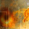
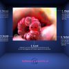
The medium can be a place for strong optics though, like Alien parody mashups, a sub-genre of colourful slime videos and hosts who perhaps dress on the more provocative side of things.
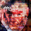
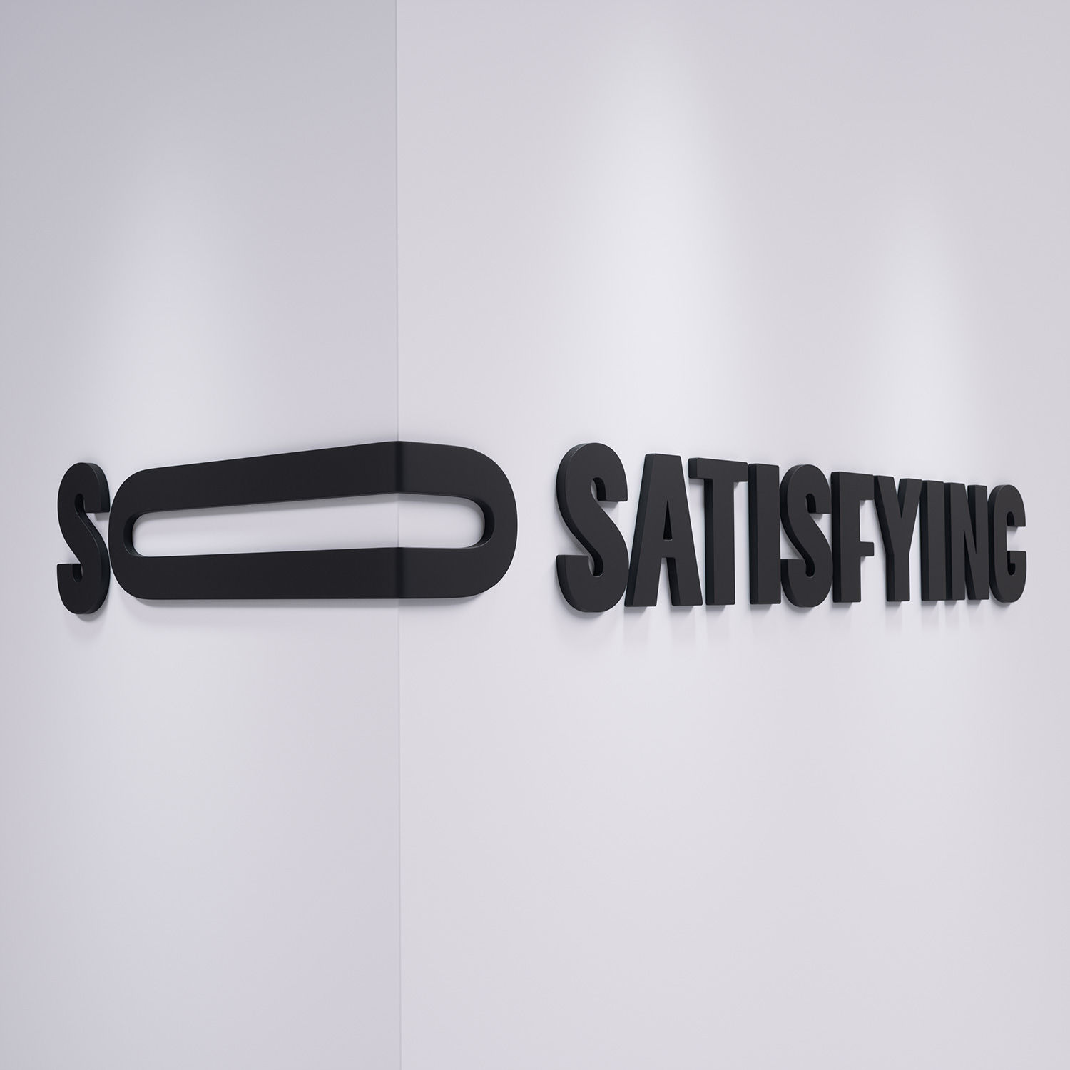
Moving swiftly on, we present you with the branding for the world’s largest ASMR content provider, So Satisfying, as created by the ever-reliable minds at agency Vault49.
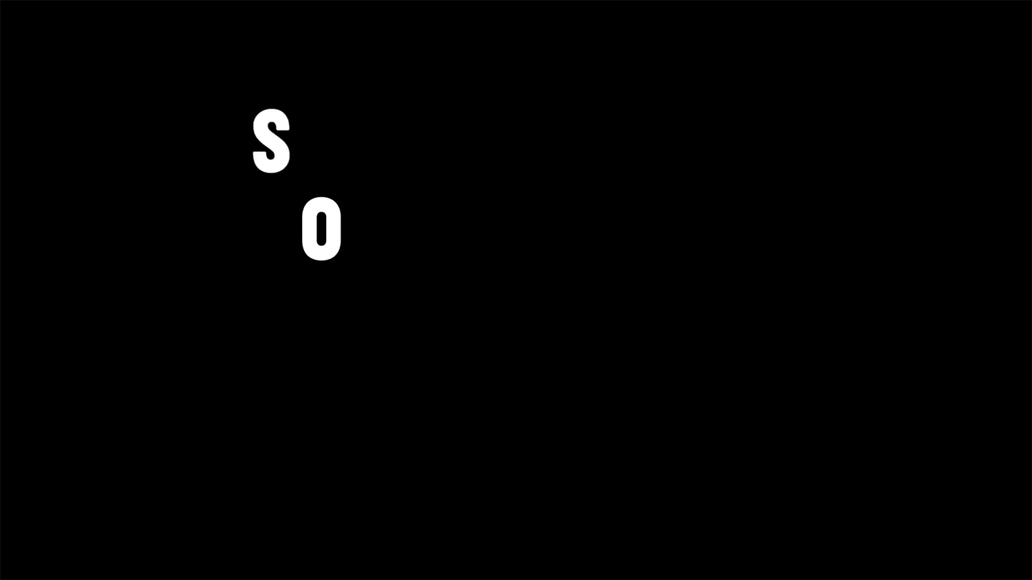
They also got from Vault a rather clever logo that draws out the ‘O’ in So (imagine Ross from Friends saying it whilst in a fit of passion.
“We wanted to exaggerate the word ‘so’ in ‘so satisfying, as their content is ‘sooooooooo satisfying’ – in essence, it is a visual way of representing the emotional response to their content,” says Vault49 creative director Leigh Chandler. “Initially, we just rotated the capital O 90 degrees, but then wanted to stretch it further in animation to mimic the way someone would say it out loud.”
That the logo represents how the text is supposed to sound is fitting when you consider this is ASMR branding we’re talking about. Instead of sound, we have visuals – but that may all be about to change.
“We are very keen to further develop the So Satisfying identity into a sonic brand, and we’re currently working with the team to develop ideas for this,” Leigh reveals to Digital Arts. “We believe that to truly connect with people, brands should embrace all of the senses in how they represent themselves.”
“We also created a shorthand version of the logo for use on the Instagram profile, which simply reduces the logo to ‘So’. Being the most unique part of the name and identity, it made sense,” Leigh continues.
“In most circumstances we suggest using the black and white version of the logo to allow the content to really shine, but in some cases this felt too heavy, so we created a secondary version.
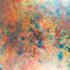
“This one utilises a gradient of vibrant clashing colours, that seems to ‘vibrate’ when you look at them, in-keeping with the overarching multi-sensory design strategy.”
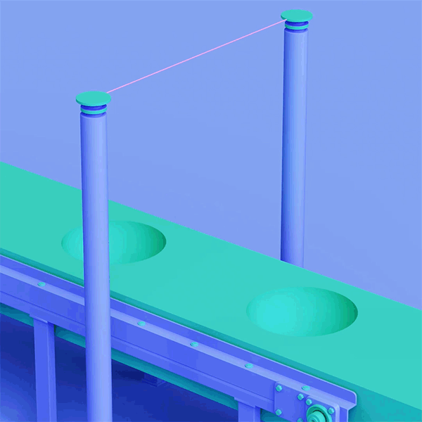
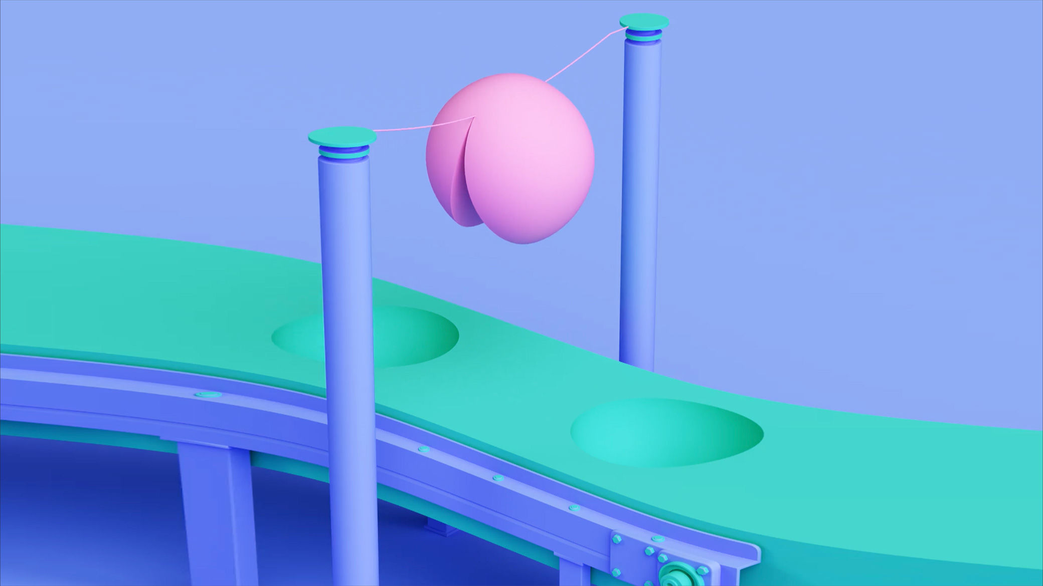
Also in-keeping with that strategy are the animations Vault49 created as part of the branding. Although CG-made, these loops were actually inspired by the fundamentally realist ASMR videos that you see on YouTube.
“Much of the existing user generated content involves slicing in some way – from cutting the teeth off a comb with a hot knife, or simply slicing through butter.
“We were inspired by what people were already posting, but gave it our own spin using the amazing CG talent we had at hand, which meant that we could more carefully control the art direction and have content which was truly unique for the brand.
“We used the team members as guinea pigs when testing various animations – what shapes feel pleasing? What movements are satisfying to watch?” Leah writes. “The comments we received really helped to demonstrate that we were creating content that people truly emotionally responded to – feedback such as ‘oh no that’s stressing me out!’ or ‘ouch, that feels painful!’’ meant that these got pushed to one side.”