“THE SOUND OF COLOR” INSPIRED BY VALSPAR’S 2021 COLORS OF THE YEAR
Today, industry leading paint and coatings brand, Valspar, from the Sherwin-Williams Consumer Brands Group, announces “The Sound of Color” inspired by its 2021 Colors of the Year. As people are seeking solace and calm like never before, Valspar is empowering us to take control of our environments and shape them to support our best selves.
The 2021 Colors of the Year, announced in Sept. 2020, are 12 livable shades that evoke calm, serenity and simplicity, and were specially curated to help us take charge of physical spaces so they foster our best mental space. Especially now that our homes have become our offices, our entertainment centers, and even classrooms –– the colors, sights, and sounds that surround us are more critical than ever.
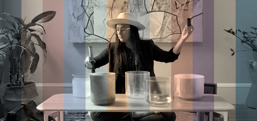
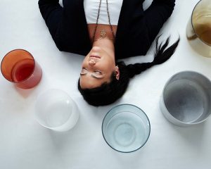 Valspar is partnering with author, sound therapist and meditation teacher Sara Auster to bring consumers into the world of color through a multi-sensory experience. Her work includes calming visuals, unique sounds, and one-of-a-kind color meditation experience. Auster has spent the past decade introducing sound baths to audiences across the globe.
“I’m grateful for the opportunity to work with an iconic paint brand like Valspar,” says Sara Auster. “Collaborating to bring these color meditations to life for each of the 2021 Colors of the Year was a truly unique experience. I hope these moments of pause we have created help consumers connect to comfort and wellbeing.”
Valspar chose to partner with Auster for “The Sound of Color” because of her original teaching methods and transformative experiences. In today’s world the colors, sights and sounds that surround us are more critical than ever before, and Valspar knew Auster’s ability to convert colors into soothing, calming, and uplifting experiences would connect with consumers.
“This was a revolutionary idea for Valspar, taking the signature colors the brand is known for and creating a multi-sensory experience that goes much deeper than colors on a paint swatch,” says Sue Kim, Valspar Color Marketing Manager. “We are very pleased with how this project turned out and think our customers will really enjoy interacting with our 2021 Colors of the Year on a whole new level.”
When forecasting the 2021 Colors of the Year, the color experts at Valspar observed global lifestyle trends that have shifted significantly from last year. The rise in external stressors has correlated with consumer’s increased interest for mindfulness and self-care activities.
Yoga, meditation, aromatherapy and other practices have gained traction and moved from fringe to mainstream in the past decade. In 2019 more than 20% of employers offered a mindfulness program – and that accelerated significantly throughout 2020.
Each of the twelve 2021 Colors of the Year includes a guided visualization and a breath practice experience. Six of the colors include meditations to calm, relax and soothe while the other six colors include meditations to focus, energize and uplift.
“The Sound of Color” Inspired by Valspar’s 2021 Colors of the Year
All 12 colors are available at Lowe’s and independent retailers nationwide. Please note, color names and shades vary slightly at each retailer. See below for the full list of colors and how they breathe life into spaces.
- Blissful Blue
- Serene – An organic color that evokes the calm and quiet of early mornings and new beginnings.
- Lowe’s: 4005-3C Blissful Blue
- Independent retailers: V111-4 Norwegian Night
- Serene – An organic color that evokes the calm and quiet of early mornings and new beginnings.
- Soft Candlelight
- Optimistic – This radiant, warm color invites optimism with its golden glow.
- Lowe’s: 3005-6C Soft Candlelight
- Independent retailers: V050-1 Morning Blossom
- Optimistic – This radiant, warm color invites optimism with its golden glow.
- Granite Dust
- Secure – Conjuring the comforting colors of a stronghold, Granite Dust helps fortify you against the worries lurking beyond your walls.
- Lowe’s: 5006-1C Granite Dust
- Independent retailers: V142-3 Gray-Green Linen
- Secure – Conjuring the comforting colors of a stronghold, Granite Dust helps fortify you against the worries lurking beyond your walls.
- Cherry Taupe
- Content – So soft you can almost snuggle it; this earthy color adds richness and luxuriousness to reinforce your sense of accomplishment.
- Lowe’s: 1005-10A Cherry Taupe
- Independent retailers: V081-4 Burnished Apricot
- Content – So soft you can almost snuggle it; this earthy color adds richness and luxuriousness to reinforce your sense of accomplishment.
- Arizona Dust
- Courageous – Vibrant and bold, focusing on this color can bolster your courage for whatever you’re facing next.
- Lowe’s: 2003-8A Arizona Dust
- Independent retailers: V045-3 Peach Squared
- Courageous – Vibrant and bold, focusing on this color can bolster your courage for whatever you’re facing next.
- Garden Flower
- Sophisticated – This color captures a sense of sturdy growth and reliable sophistication that puts guests and hosts alike at ease.
- Lowe’s: 5004-3B Garden Flower
- Independent retailers: V097-2 Succulent
- Sophisticated – This color captures a sense of sturdy growth and reliable sophistication that puts guests and hosts alike at ease.
- Academy Gray
- Contemplative – The subtle blue present in this moody gray brings a comforting quality to serious contemplation.
- Lowe’s: 5001-2A Academy Gray
- Independent retailers: V138-5 Flannel Gray
- Contemplative – The subtle blue present in this moody gray brings a comforting quality to serious contemplation.
- Unforgettable
- Relaxing – So endless in its invitation to relax that it’s luxurious.
- Lowe’s: 7003-2 Unforgettable
- Independent retailers: V094-1 Quill
- Relaxing – So endless in its invitation to relax that it’s luxurious.
- Gallery Gray
- Confident – For the modern minimalist whose approachable elegance demands a space as effortlessly confident as they are.
- Lowe’s: 2006-10B Gallery Gray
- Independent retailers: V133-4 Gentry Grey
- Confident – For the modern minimalist whose approachable elegance demands a space as effortlessly confident as they are.
- Dusty Lavender
- Balanced – Bright but soft, subdued but inviting; Dusty Lavender encourages perfect equilibrium.
- Lowe’s: 1002-7C Dusty Lavender
- Independent retailers: V078-4 Violet Dusk
- Balanced – Bright but soft, subdued but inviting; Dusty Lavender encourages perfect equilibrium.
- Maple Leaf
- Spirited – Natural at its core, this color invites you to embrace yourself at your most authentic.
- Lowe’s: 2008-8B Maple Leaf
- Independent retailers: V089-2 Spiced Latte
- Spirited – Natural at its core, this color invites you to embrace yourself at your most authentic.
- Lucy Blue
- Optimistic – This energetic blue injects effortless joy and optimism into any environment.
- Lowe’s: 5001-5C Lucy Blue
- Independent retailers: V103-4 Grand Boulevard
- Optimistic – This energetic blue injects effortless joy and optimism into any environment.
Free color tools available from Valspar
When you want to update your home with a small change that has a big impact, Valspar offers a number of Color Discovery Tools to help you feel confident in your decisions. These tools allow you to find your perfect color faster. DIYers can also save a trip to the store by having paint chips sent straight to their home for free.
Source: Unique Multi-Sensory Meditation Allowing You to Experience Colors | The Ritz Herald

