As Pantone announces its 2021 Colours of the Year, Emina Goodman explains the key relationship between colour and food, and predicts what to watch out for this year.
It’s often said that we eat first with our eyes, which is why the colour of foods and beverages matters so much. Colour enhances sensory appeal and the eating experience by not only improving visuals, but also by helping us to identify and differentiate flavours.
With more than 92 percent of shoppers saying that visuals have the most influence over their purchasing decisions, there is an exciting opportunity for food and beverage manufacturers to get creative with colour.1 By leveraging colour psychology together with insights into the latest colour trends, brands have an opportunity to create products that connect with consumers on a deeper, more emotional level.
Visual appeal and connotations
For more than 20 years, Pantone’s Color of the Year campaign has influenced product development and purchasing decisions in multiple industries. This years colours, ‘Ultimate Grey’ and ‘Illuminating’ yellow, were selected due to their symbolic contrast; the former represents the solemnity of 2020, while the latter signals hope for a brighter future. The combination captures a cultural mood, looking beyond surface trends and into the consumer psyche, which explains why the event is always such an influence.
These colours offer inspiration for food and beverage manufacturers who want to diversify and enhance the visual appeal of their portfolio for greater consumer appeal. For example, yellow is often associated with positivity and reassurance.
From a wellness perspective, yellow ingredients like citrus and turmeric help consumers link the colour to energy support, improved digestion and reduced inflammation.2 Well-informed shoppers are increasingly associating these health benefits with immunity, providing food and beverage manufacturers an opportunity to appeal to these concepts with innovative, colourful applications.
Grey may seem a less obvious choice for food and beverage manufacturers, but it offers a variety of more understated applications. Grey foods like mushrooms imply a filling, hearty alternative to traditional animal proteins. Grey can also encompass lighter or ‘colourless’ tones associated with resetting, renewal or finding comfort in healthful choices – from a white bean spread flecked with black pepper, to a steaming bowl of konjac noodles in clear broth.
Why does colour matter?
Each colour in the spectrum comes with its own set of emotional and physical connotations, some of which are broadly universal, while others are culturally-specific. Colour can create meaning, which puts it at the heart of an enjoyable food or beverage consumption experience. It can be used as a key to the story of how a product is made and the benefits it offers, both on a functional level and through subtext and emotional appeal.
This is easiest to see in the world of confectionery, where colours have long-standing correlations to classic flavors, eg, red for strawberry or yellow for lemon. Colour is also one of the key indicators of ‘doneness’, as seen through levels of browning in a variety of foods, including meats and breads.
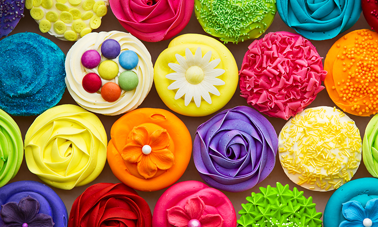
As colour psychology is increasingly applied to food and beverage products, we’re seeing it overlap with other trends in this space. For example, as the demand for plant-based and organic products rises, consumers now expect natural ingredients for food colouring. In the clean-label era, people are actively checking to discover – in other words is the sunny yellow icing on a lemon cupcake made from actual lemons?
How do you achieve natural food colouring?
ADM’s spectrum of natural colours is achieved through a combination of advanced technology, extraction processes, patents and technical expertise. For example, we derive a vibrant yellow from turmeric, which is known for its potential anti-inflammatory properties. We also work with botanicals such as beta-carotene, annatto and yellow carrot to produce a variety of yellow shades that are stable across a variety of application formats.
At the grey end of the spectrum, we have created a range of attractive hues using soft tints of spirulina, a type of blue-green algae that cultures across the world have relied upon as a food source for hundreds of years.
References
- https://colorcom.com/research/why-color-matters
- J. Bosch et al, “The Application of Color in Healthcare Settings,” 2012 https://www.ads.org.uk/wp-content/uploads/The-Application-of-Colour-in-Healthcare-Settings.pdf


