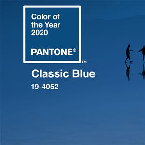
Pantone
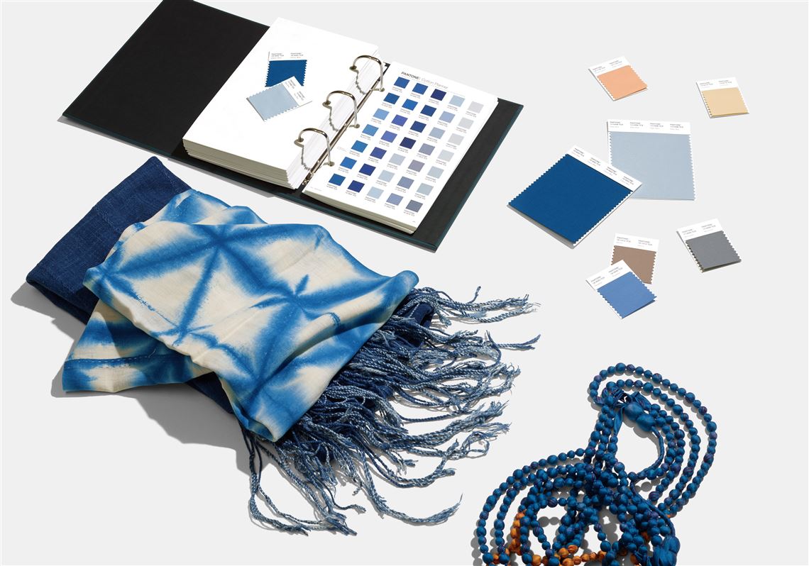
For the first time, Pantone turned the announcement of its color of the year — “a timeless and enduring hue elegant in its simplicity” — into what it describes as “a unique multi-sensory experience.” It teamed with a handful of companies to create footwear, jam, beverages and even business supplies in Classic Blue.
Then Pantone tapped New York City-based sonic branding agency Audio UX to produce a sound to accompany the mellow hue. It’s called “Vivid Nostalgia,” a 3-minute instrumental mix that “takes us to a place of comfort and familiarity” and bridges “the gap between past and present,” according to a press release.
If that’s not enough, creative music platform LANDR released the Classic Blue sample pack of 200 music samples and loops that it calls “a conceptual audio embodiment” of the color.
“As we all head into a new era, we wanted to challenge ourselves to find inspiration from new sources that not only evolve our color of the year platform, but also help our global audiences achieve richer and more rewarding color experiences,” Laurie Pressman, vice president of the Pantone Color Institute, said in a press release.
As a style editor, I’ve been following Pantone’s yearly color declaration for about a decade. It’s always amusing to see if the pick is a hit or a flop. Classic Blue is an approachable color that’s soothing to the eye and fairly easy to incorporate into a wardrobe or a living room.
But does it translate well into a sound? Depends upon who you ask.
“I think they took their liberties on this one,” says Bharath Chandrasekaran, a professor and vice chair for research in the department of communication science and disorders at the University of Pittsburgh.
He’s an auditory neuroscientist by training. That involves studying the perception of sound and the cross-modal interactions between sound and sight. “Blue from a more symbolic perspective is more calming, and I think that’s what they were going for, a larger level abstract symbolism.”
Blue noise, he says, has a shorter wavelength and a higher frequency than red. Yet “Vivid Nostalgia” has a more low-frequency rhythm. “That was what was incongruent,” he said.
There’s a small population of people in the world who associate colors with sounds because of a condition called chromesthesia, a type of synesthesia. It’s the result of altered connectivity between the brain regions that connect sound and vision. But even for them, what they hear when they see a particular color is fairly individualized.
“I’m super curious about playing this for someone who has chromesthesia and getting their reaction to it,” Mr. Chandrasekaran says.
There are loose associations between color and sound in the music world, too. In instrumental performance, for instance, color tone refers to the timbre or quality of the sound.
“They’re using color as an analogy for something that’s hard to describe,” says Jesse Stiles, a musician, sound artist and assistant professor of sound media at Carnegie Mellon University.
The color blue has significance in the music world because of the blues style, he says. “It’s the only genre strongly associated with a color.”
He doesn’t expect the “Vivid Nostalgia” sound to impact the music world in the way Pantone’s color predictions sometimes influence what appears in stores.
“Stylistically, they’re referring to pretty popular genres — low-fi, hip-hop, electronic dance music. If what they’re going for is contemporary and relaxing, I think they’ve definitely found the pocket they’re going for,” he says.
“I was expecting some sort of droning, ambient sound,” says Lindsey French, a visiting professor in the department of studio arts at the University of Pittsburgh. “It’s not what I was expecting, but it’s interesting. It’s chill and soothing.”
Beyond the fact that color and sound are both measured in waves, ties between Pantone’s color pick and the music are pretty abstract and open to interpretation.
“They’re talking about it as an anti-anxiety blue, but it also seems to be the blue of Facebook and Chase Bank and Venmo, which are like all these digital experiences that also give us some kind of anxiety,” Ms. French says.
For the most part there is no real connection between color and sound. she says.
“We all come to things with different experiences. … We have full license to make those connections for ourselves.”
Source: Pantone wants you to see, taste and hear Classic Blue | Pittsburgh Post-Gazette