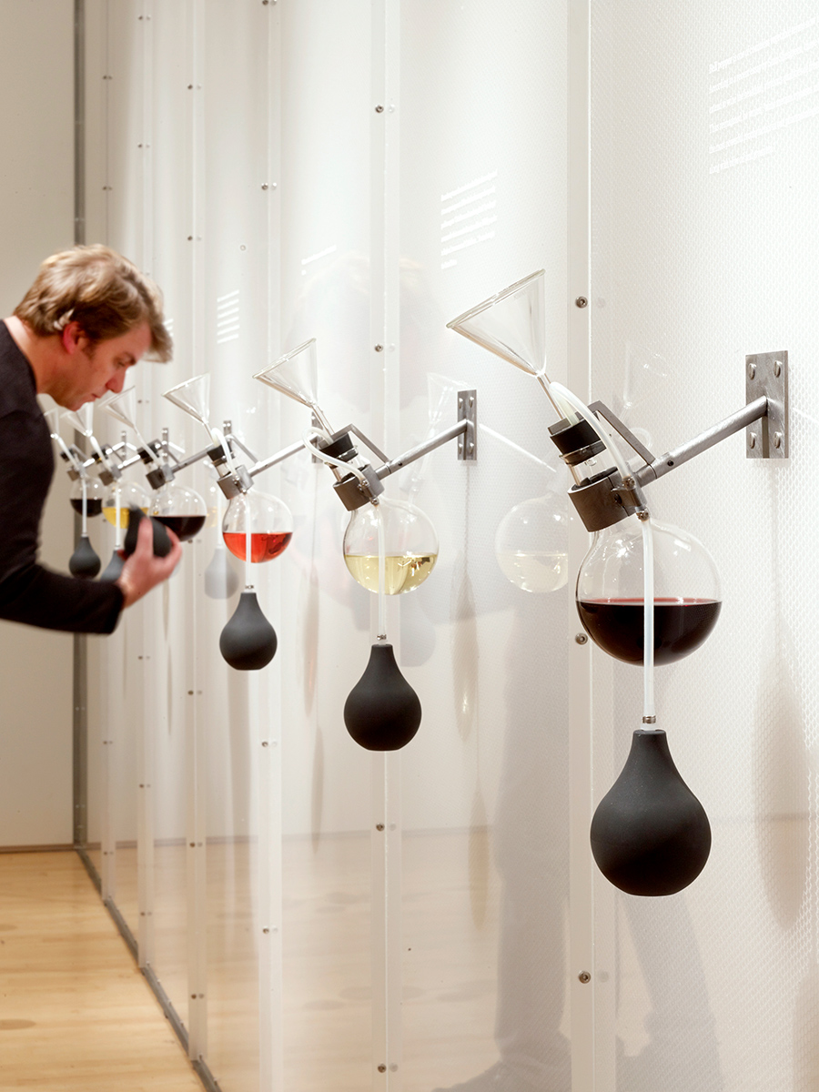
Diller Scofidio + Renfro’s 2010 How Wine Became Modern exhibition at the San Francisco Museum of Modern Art is one of a series of museum shows the architects have developed over the years that challenge the master sense. The exhibition design, which included a “smell wall,” attempted to make tactile the sensory aspects (aroma, color, texture) of wine.Courtesy Matthew Millman
What comes to mind when you encounter the term “sensory design”? Chances are it is an image: a rain room, a funky eating utensil, a conspicuously textured chair. But the way things actually feel, smell, even taste, is much harder to capture. This difficulty points to how deeply ingrained the tyranny of vision is. Might the other senses be the keys to unlocking broader empirical truths? Does the ocular-centric bias of art, architecture, and design actually preclude a deeper collective experience?
Such questions are at the heart of the current Cooper Hewitt exhibition The Senses: Design Beyond Vision, curated by Ellen Lupton and Andrea Lipps. “People go to museums because they want an authentic experience with real things, but their only experience is visual; how is that authentic?” Lupton asks. With some 78 projects, the show takes on the idea that sensory design, or consciously designing for the full spectrum of sensory experience, can better connect us to the material world and help us find our proper place in it.
While sensory design has entered popular discourse only in the past decade, the ideas behind it first emerged in the 1950s, in the work of radical art collectives Zero in Europe and Gutai in Japan. Recognizing the limited capacity of sight alone to affect their audiences, these artists directed their work at all the senses. The result was a profound form of critique that confronted the consumerist postwar paradigm shift head-on.
Zero sought an entirely fresh approach, summoning an art that would incorporate a full sensory spectrum. Light, sound, reflection, and optical illusions were second nature, as were live actions such as striking, slicing, burning, and setting off explosions. Gutai followed a similar range of activities but was a touch more theatrical: Large-scale multimedia environments and Technicolor dresses made of light bulbs were common props for equally peculiar performances.
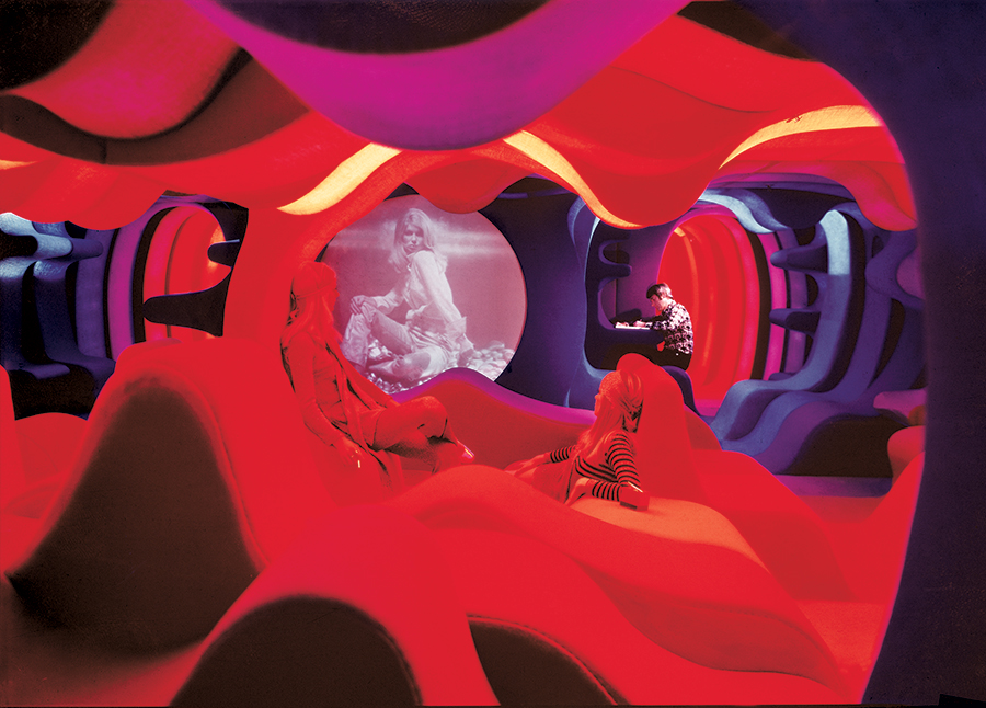
Verner Panton’s futuristic Visiona 2 exhibition (1970) was staged on a boat docked on the Rhine. The immersive environment collapsed the differences between wall and floor, rendering every fuzz-textured surface perfect for reclining. That, combined with the bright colored lights marking different zones, gave the space a hedonistic air.Courtesy Panton Design, Basel
In 1970s Manhattan, artists disrupted the predominance of vision by enlisting the senses as a political tool. Influenced by disco and rock as much as by activist culture, light artists like Anthony McCall and Doug Wheeler manipulated light, sound, and space, while performance artists like Joseph Beuys, Yoko Ono, and Marina Abramović produced public “happenings” that broke art out of the white cube and onto the street. Conceptual artists such as John Cage and Gordon Matta-Clark recorded silence and cut open buildings to deconstruct our biases about both music and architecture.
In the ’80s and ’90s, Postmodernism and visual culture studies gave birth to a cult of the image: Theorist W.J.T. Mitchell noted a “pictorial turn” after which pictures controlled language, not the other way around. Still, there were projects like La Monte Young and Marian Zazeela’s psychedelic Dream House (1993) and the combined practice of the late Japanese artist Shusaku Arakawa and American poet, writer, and philosopher Madeline Gins that fought back against the dominance of 2D. A neon-pink glow synchronized to music followed visitors as they moved throughout the Dream House, while shrunken corridors, dunelike floors, and kitchen-counter doorways typify Arakawa and Gins’ Alice in Wonderland–like Reversible Destiny Lofts in Mitaka, outside Tokyo.
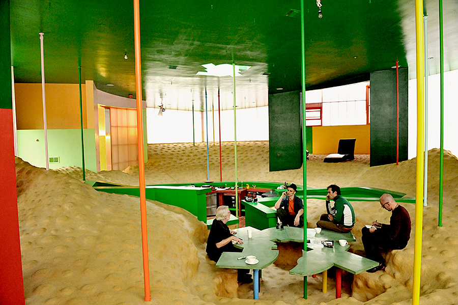
The late architectural pair Arakawa + Gins (both died earlier this decade) were best known for their counterintuitive rallying cry “We Have Decided Not to Die.” The buildings and environments created by the practice, whose Reversible Destiny Foundation remains active, reflected this refusal; by deploying nonorthogonal geometries, undulating floors, and isolation pods—as they did in the Bioscleave House in East Hampton, New York (pictured)—Arakawa + Gins argued that they were steeling residents against the effects of aging. For the duo, the challenging design acted as an “interactive laboratory of everyday life.”Courtesy Dimitris Yeros, © 2008 Estate of Madeline Gins, Reproduced with permission of the estate of Madeline Gins
These historical works all used the senses as a means of arousing previously passive audiences, exposing them to sociopolitical shifts. If the hangover of global warfare and a new counterculture set the stage for the original vision’s attitude of defiance, swiftly followed by the tongue-in-cheek posturing of Postmodernism, new technological developments define today’s resistance.
For the Swiss architect Philippe Rahm, technology is a tool to return architecture to its basic components of heat, light, and air. This past August saw the completion of his 172-acre Taichung Central Park in Taiwan. By harnessing what he refers to as the “three layers of urban design”—heat, humidity, and pollution—Rahm created the park specifically to suit Taiwan’s subtropical climate. A series of liquid-spitting, steam-emitting apparatuses segment and augment the landscape. There are distinct areas for visitors to either cool off (an armature of some kind leverages the cooling wind coming in from the north) or get hotter (another exploits the sweltering humidity brought in from a nearby reservoir by the sea breezes).
“The invention of steel and concrete fundamentally changed architecture, but now global warming and the need for sustainable space are reshaping design,” argues Rahm. “We can’t live in that Miesian open-plan uniform fantasy world anymore, but a heterogeneous space with changing space, light, temperature, and humidity is becoming more important.” His ongoing “domestic astronomy” project rearranges the home into an energy-saving vertical (and thereby anti-Miesian) layout. Hot air rises, so Rahm’s vision keeps areas that require heating, like the bathroom, on the top floor; it also doesn’t bother heating corridors or the bedroom, as residents’ time there is fleeting or spent under blankets. By combining science with a deep awareness of the body, Rahm’s multisensory architecture performs a pedagogical function, wherein its occupants are no longer passive users of space but active learners about the changing climate they inhabit.

In September the 172-acre Central Park in Taichung, Taiwan, opened. Designed by Swiss architect Philippe Rahm, the experimental park draws on heat, humidity, and pollution to frame the visitor’s experience of the environs. These conditions will be ameliorated by added foliage— whether it’s more leafy trees to absorb moisture from the air and pollutants from the city, or aboveground roots to cool things down through evaporation.Courtesy Philippe Rahm
Reducing the capacity for visual understanding was the aim of the Blur Building, designed by the New York–based firm Diller Scofidio + Renfro (DS+R) for the 2002 Swiss Expo. “Why don’t we make a building where there is nothing to see, except our own reliance on seeing?” cofounder Elizabeth Diller recalls asking herself. She and her colleagues built a small structure at the base of Lake Neuchâtel in Switzerland, only to then conceal it in a thick cloud of fog (created using 35,000 nozzles and a smart weather system). This amorphous, lo-fi landscape necessitated the use of other senses to navigate the space, Diller explains. “There was a beauty pageant group that went through and emerged with makeup dribbled down their faces.”
Vision, voyeurism, and exhibitionism—all intensified by networked technologies—frame DS+R’s practice at large. The firm’s critique of these, ironically, is possible only through technological innovation itself, whether it’s the sensor-mediated olfactory experience of The Art of the Scent (2012) or the omniscient eye of a drone slipping between floors in Post-Occupancy, a new film currently showing at the Venice Architecture Biennale.
That isn’t to say that architects should treat technology as so much brick and mortar. The materiality of the seemingly immaterial is a leitmotif running through The Senses. The Cooper Hewitt show is a hands-on romp through a world of multisensory delights, including 3D-printed ceramics infused with eau de curry by the Californian “maketank” Emerging Objects; Kate McLean’s psychogeographic urban “smellmaps,” created through exhaustively logged smell-finding reconnaissance trips; and Jinhyun Jeon’s much-buzzed-about dessertspoon series, which the South Korean designer devised to enhance the pleasures of pudding.
Yet with the amount of work on display, the exhibition can feel like a trade fair of novel gizmos at times. Visitors have their senses stimulated but exit without their view of the world enlarged.
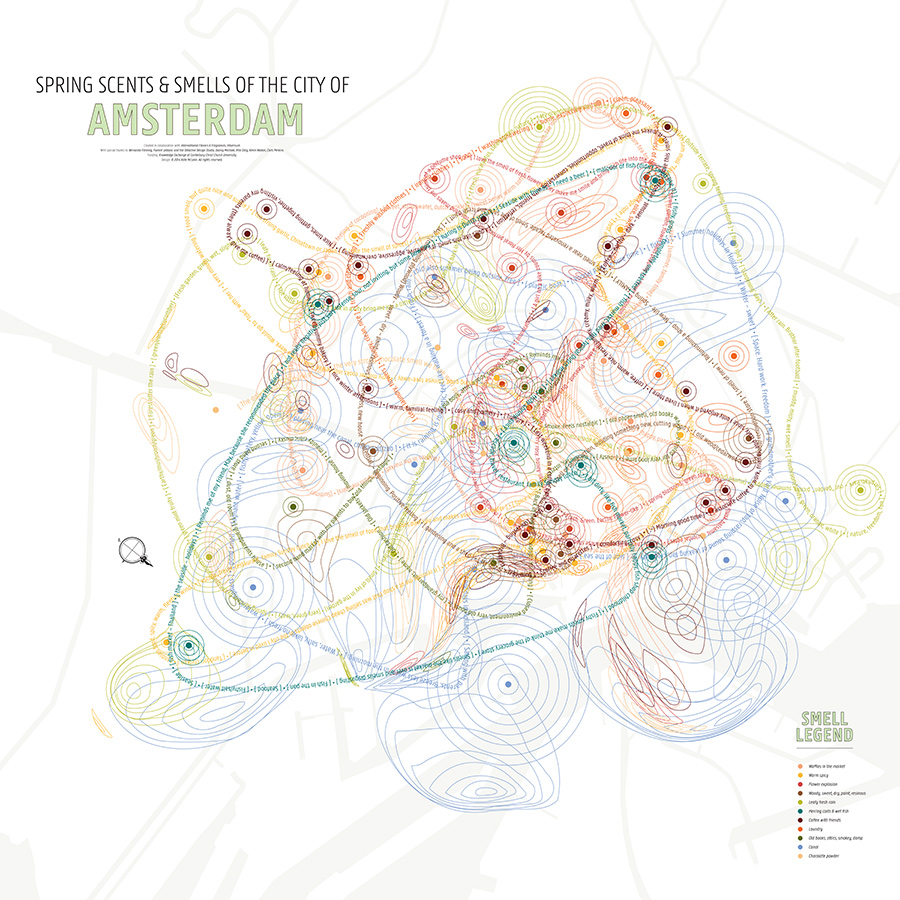
The British graphic designer Kate McLean creates urban maps from data recorded in the course of “smellwalks,” on which she is accompanied by locals. The “smellnotes” logged on any given outing include the intensity, location, and description of odors, in addition to the subjective associations they inevitably prompt.Courtesy Kate McLean
Far from theme-park gimmickry or art-world antics, innovative inclusive-design concepts—those that challenge biases like ableism—demonstrate that multisensory design has a real-world resonance. DeafSpace is one such concept; first developed in 2005 at Gallaudet University in Washington, D.C., the only liberal arts institution geared toward the deaf and hard of hearing, it puts forward more than 150 principles that form a new kind of design language. For instance, light and color are materials to be embraced for their innate abilities to connect people. Concrete should be covered in wood veneer, which allows vibrations to travel across a space—necessary for the blind in navigating their surroundings. These practices inform the design of Gallaudet’s campus expansion, which is expected to break ground in 2019.
In this instance, a multisensory approach bridges the hearing and deaf communities. It is not overly optimistic to think that it could perform a similar function in other facets of society—and soon. Already, sensory technology including virtual and augmented reality is nearly as ubiquitous as the laptop, even though it remains cumbersome and intrusive. “We transport ourselves optically at the expense of other things,” Diller says. But, she adds, “as the hardware goes away, there will be an inclination to absorb tech into the toolkit we use.”
But when such tools inevitably become a part of our everyday lives, and without the collateral cumbersome distraction, will we finally move on from our valorization of the visual? This is less certain. “Technology is creating new opportunities for designing sensory experiences—but it can also diminish our sensory engagement,” suggests Lupton, who points out that even the most advanced touch screen or VR headset that has no haptic or audio component is useless to a person who is blind. Whether technology helps us achieve a shared multisensory existence or further divides us is yet to be seen (or tasted, smelled, felt, or heard).
Source: Architecture You Can Smell? A Brief History of Multisensory Design

