While working at MING Labs, I had this unique opportunity to help an artisan candle business on digital transformation. From the user research, we’ve learnt the scent is one of the most important considerations while purchasing a candle product. However, customers find it difficult to choose the right scent through online shopping: simply because it’s impossible for them to smell the scent in front of the screen. When we design interfaces of the online shopping platform, how can we better visualise the scent to make it easy for customers to associate the scent they are looking for?
What does a smell look like?
There are a few scientific experiments. A lab at University of Colorado Boulder studies the fluid mechanics of fragrances, as part of a nationwide project to build a robot that can smell.
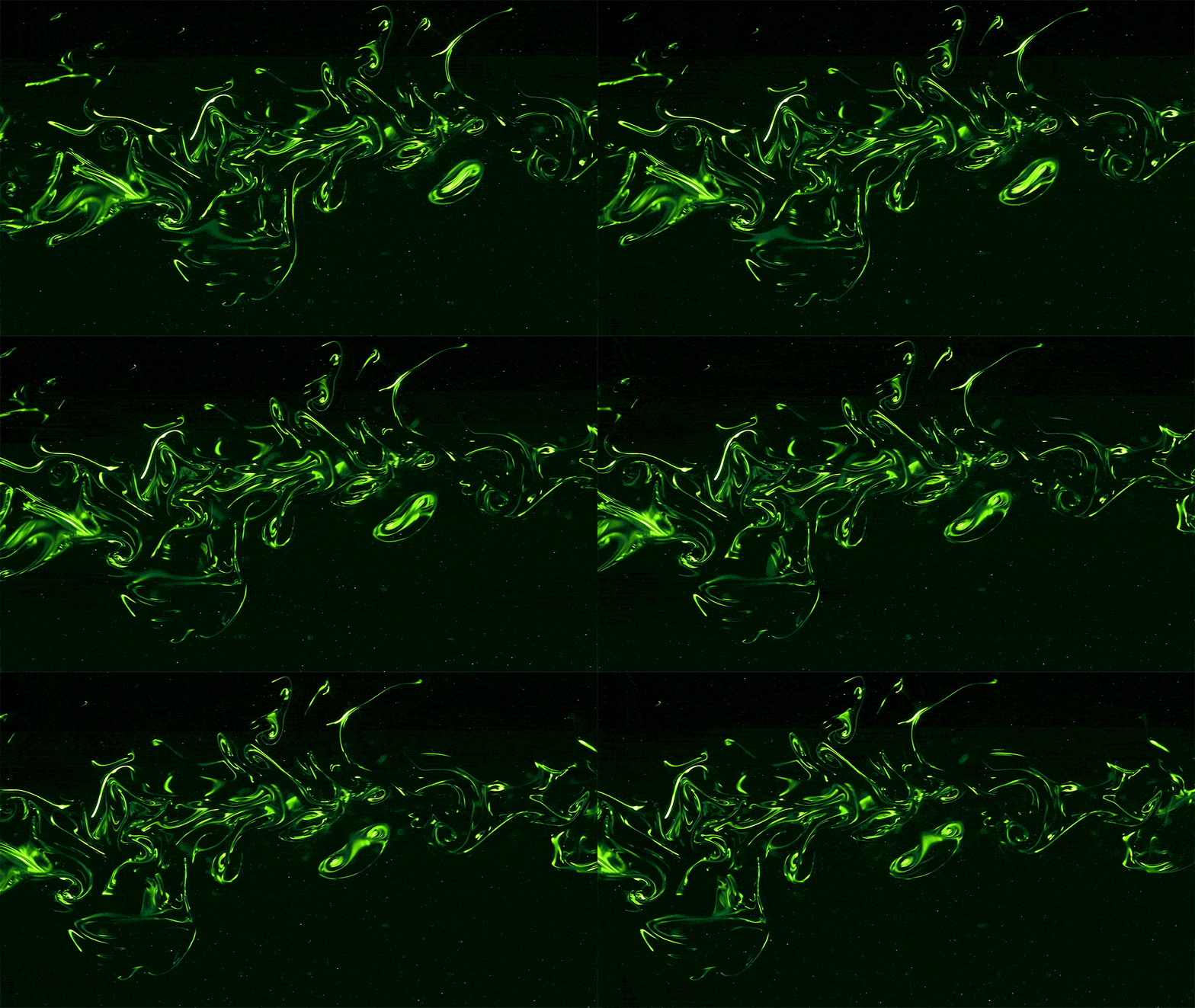
While looking at the constantly changing green fluid shapes, I’m wondering: well, the geometry and movement might be scientifically correct, however, does it help candle customers to understand what scent it is?
We’ve also found some artists and designers working on different forms of visual explorations to “see” the scent. Among these, Kate McLean’s research on sensory maps caught our eyes. She’s been creating sensory maps for many cities; and in some cases, she invited local inhabitants to visit the neighbourhoods and annotate the map with “how they’ve followed their noses”. Her smell maps are aesthetically appealing. Though the reasons behind the beautiful colours and geometries are unknown for us, her approach involving locals to annotate the smell of their neighbourhoods inspires us an exciting idea: letting users draw scents by themselves and analyse how people visualise them.
A user-centric approach to visualise scents
Tools
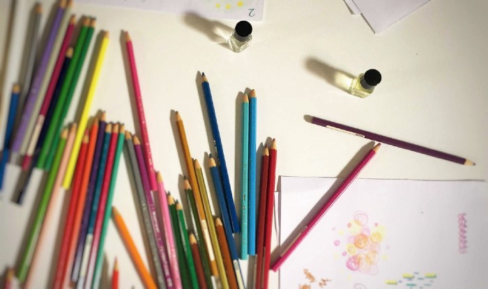
- “le nez du vin”, a tool which is used to train and develop olfactory acuteness. Each bottle is specified with one particular scent. We prepared a few bottles with a range of easy-to-guess scents such as “orange”, “pear”, as well as less obvious ones such as “sandalwood”, “oak”, “eucalyptus”
- Different types of drawing tools: pens, colour pencils, marker etc.
- White sheets of paper
Tasks
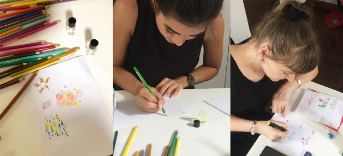
- We verbally name a few scents and ask participants to draw the scents on the paper
- Let participants smell each bottle of “le nez du vin” without telling them what scent it is, then participants draw the scent accordingly
Process
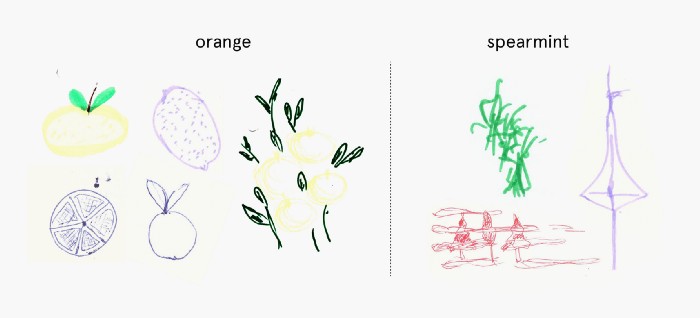
To start with, we first named a few popular candle scents, such as “orange”, “spearmint”. Since the scents are all directly related to objects, most participants tried to illustrate that particular object, drawing oranges or leaves for “spearmint”.
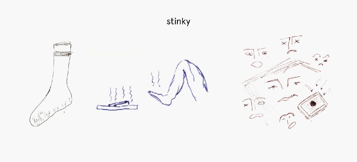
As a comparison, later we named a few scents which are more abstract, such as “sweet”, “spicy”, “stinky”. Similarly, participants tried to draw relevant objects or scenes to express their feelings about the scent: eg. for “stinky” participants drew smelly socks/foot, and flies around rotten food.
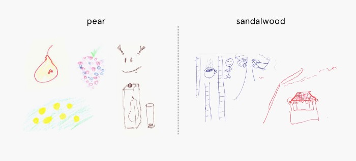
The second task is a bit more challenging as the participants don’t know what scent it is; they are asked to draw purely based on their own sensation: follow their noses. Interestingly, for the scents which seems easier to guess, eg. the fruity ones, participants again drew the objects they knew; or used some colours, geometries to represent that object if they were not 100% sure. When coming to the less obvious scents, participants’ imagination and creativity started to shine, and they tended to draw more stuff to describe the scent: in the case of “sandalwood”, one participant pictured someone meditating in a bamboo forest with a cup of tea; another one drew a small temple with some shapes of cloud.
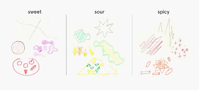
At the end, when comparing the drawings of different scents altogether, we also found some sharing perceptions in using colour and geometry: eg. yellow and orange colours are commonly seen to represent “sour”; while pink and purple are used to describe more sweet or fruity scents; in terms of geometry, participants tend to use rounded, continued lines when drawing the scent of “sweet”; while for “spicy” and “sour” more pointed and angulated forms are seen.
Findings
- People tend to associate scents with objects or scenes they are familiar with
- People have some sharing perceptions about the colour and geometry of certain scents
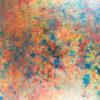
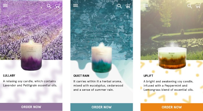
After the research, we brainstormed a variety of visuals as well as user flows of choosing scents. Learning from the findings, we experimented with two approaches: one is simply using photos of objects and scenes to represent the scent; together, we created some conceptual graphics using different colours and geometries to mimic how our brain visualises the scent.
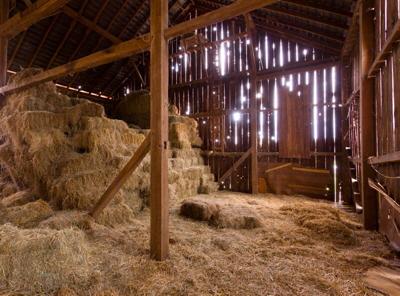
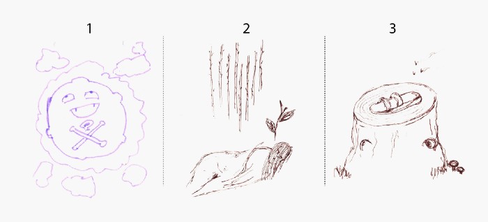
Lastly, can you guess what are the scents in the picture below?
Source: Visualising scents: a user-centric approach | by Jian He | Medium

